As a business owner, you want more customers, which is why you’ve invested in your website. You know that different customers will find your business and your site in different ways — some find you on their phone, others through their desktop, and yet others on their tablets. Your website will look differently to each of these customers, because the size of the screen determines how the website looks.
It used to be that you would have to invest into at least two different websites, one for mobile and another for desktop.
At Mr and Mrs Leads we can save you money by designing your business one website that is optimized for all platforms.
Ready To Get Started?
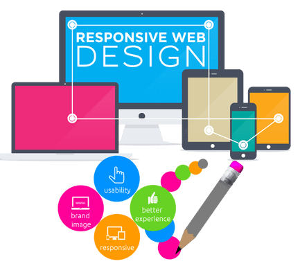
Elements Of Responsive Web Design
All of the user-friendly aspects to a responsive website are reasons for your customers to stick around and buy your products. They also induce them to come back, so not only can you still sell to those who just weren’t quite ready to make the buying decision on their first visit, but you’ll have more repeat customers as well.
What are some of the user-friendly elements that stand out? They include:
Large, easy-to-read text
Resized images that fit to the screen
An optimized, easy-to-use buying process
Easy, clear navigation
What Is A Responsive Website?
Your website speaks for your business: it gives a first impression and the way it looks will be hugely influential in the customer’s decision to buy your products or services. To see why this is the case, let’s take a walk in the shoes of a typical buyer.
Suppose you want to buy a pizza and have it delivered to your home. The company, Pizza Palace, has a beautiful website when you visit it on your home computer, but right now you’re in your car, so you pull out your mobile phone and go to the website. When you land on it, you find that the text is too small to read, the large images force you to scroll sideways and all around to find the information you need, and you can’t even click on the link to order because it’s too small. What’s going to happen? You’re going to leave the site and find another pizza deliverer.
Let’s go back to your perspective as the business owner. You lost money and the potential to build a long-lasting relationship with a customer, because your site didn’t make the purchasing decision easy enough. How many customers or patients are you likely to use that way? Considering that, worldwide, more people use their phones to browse the web than their home computers, if your site isn’t optimized for different screen sizes you’re going to lose out on quite a bit of business.
With responsive web design, Mr and Mrs Leads saves you from having to provide one website to each type of customer. That’s right. Your website is instead designed to be flexible, able to reorganize itself in response to the size of the screen of the reader. That way, whoever lands on your site, no matter where they’re coming from or what device they’re using to get there, your business’ website is optimized to make the sale.
Is Your Website Responsive
How does your site look when it’s seen through a smartphone? Is it hard to read or difficult to know what to do next? If you’re not sure if your website is responsive, put it through Google’s free mobile-friendly test, which tells you whether the site is optimized for mobile users.
Would you like to start a project with us?
Click to Call on Mobile and one of our talented staff will consult you on your online business needs.